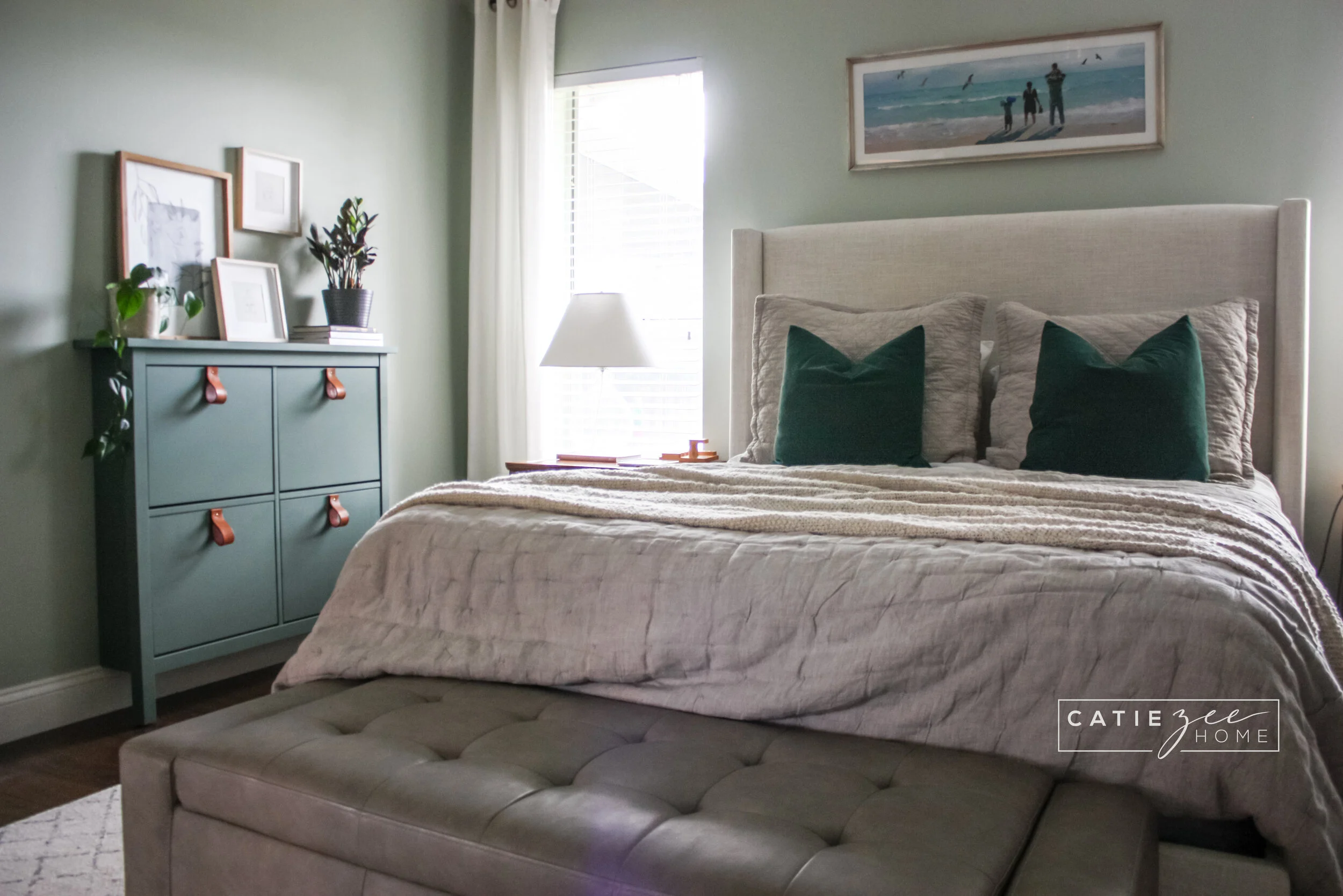
What I Wish I Had Known about Decorating when I was Younger
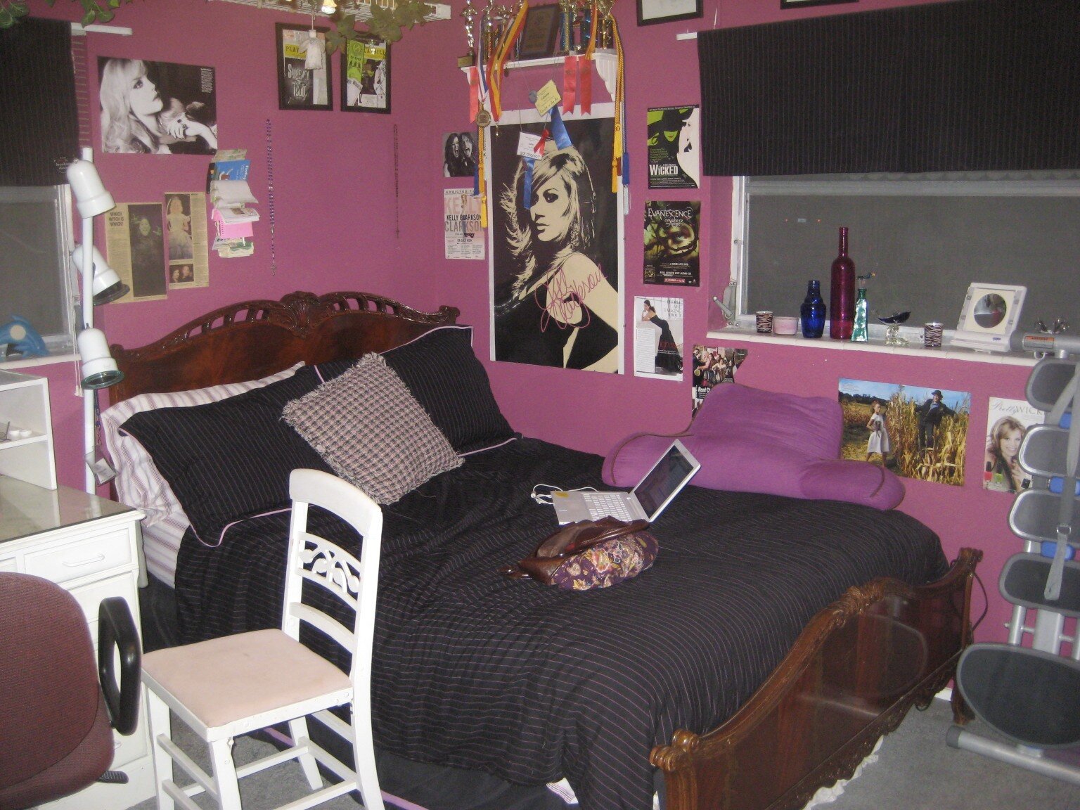
Lately I’ve been reflecting on how my design style has changed over the years, and I thought it would be fun to share a few of the things I’ve learned with you guys. Before I get into it, I need to paint a picture for you. Picture 16 year old Catie sitting in her MAGENTA bedroom, eyes glued to the latest episode of Color Splash on TV. There’s a giant poster of Amy Lee from Evanescence hanging on the wall and the ceiling is painted to look like the sky. I was sure my room was ready for a feature on HGTV back then, but in hindsight, there are some (a ton of) things I could have done differently.
I remember walking into someone’s house and thinking “wow, this room is gorgeous!” but I couldn’t put my finger on why. As I’ve grown, I have changed by stance on a lot of things when it comes to design and begun to understand why certain rooms just look “right”. These are all the things I would have told me younger self if I’d had the chance:
Just because it’s not trendy doesn’t mean it’s not good design
Say it again for the ones in the back: Just because it’s not trendy doesn’t mean it’s not good design! I can’t tell you how many times I turned my nose up at something just because it wasn’t what everybody else was putting in their house at the time. My mindset was pretty much “if it can’t be bought at Target right now, it doesn’t deserve a place in my house. Boy, was I wrong. I think when we’re young we can have a tendency to hyper focus on being trendy over all else because we feel like it helps us “fit in”, but I’m here to say - timeless design elements transcend trends and we’d all be better off to embrace them.
Mix old and new
This might just be one of the hardest lessons I learned. I can’t tell you how many times I wondered why a person would prefer to have an old piece of furniture in their house versus picking up something new and shiny at IKEA. I’m laughing just thinking about it.
Now, I’m not talking about someone holding onto a broken, non-functioning piece of furniture. I’m talking about an armchair with more traditional lines, I copper vase with patina present, a leather stool that’s been worn over the years. These were things I considered trash because they showed signs of wear, because they didn’t have trendy “lines”. I have since learned that these are the pieces that give a room SOUL. Without the imperfect pieces, designs often fall flat. Mixing old and new pieces creates a beautiful dynamic - it highlights the modern lines of the new pieces and gives them a depth they could never have on their own.
Your furniture doesn’t need to “match”
In fact, it’s better if it doesn’t and here’s why: it can make a room feel very “one note”. I’ve bought my fair share of bedroom furniture in the past, and I’m 100% guilty of passing on a piece of furniture because it doesn’t “match” the others. I was wrong to think that a room could only have one style of furniture in it to look good. I was wrong to think everything had to be the same color for the same reason. Mixing and matching furniture is what gives a space the feeling of being “collected”. It’s what makes a space feel “right”. You don’t want your home to look like a store display. You want it to feel like YOU, and YOU are an ever changing, dynamic human being with countless different qualities. You are not “one note” and your home shouldn’t be either.
Don’t skimp on scale
Scale is key in making a space sing, but I haven’t always understood this. When you’re young and you find a 5x7 rug for $50, you choose it over the 8x10 because it's cheaper! What it ends up doing is dwarfing your space, and I guarantee it ends up costing you more money down the road. Why? Because you’ll continue to buy things you think will fix your space, when it really just comes down to that darn rug being too small.
The same example can be made for decor. You buy a small lamp because it’s cheap, but when you put it on your dresser it looks “off”, so you buy a few more trinkets to make it look better, but that just ends up making it look cluttered. The scale of the lamp is the issue, and old me would have been happy to save the money on my small lamp without realizing it hurt more than it helped. Don’t skimp on scale!
Real artwork separates the boys from men
I never understood the concept of hanging paintings or prints of seemingly random things in your home. My grandmother had two portraits of Abe Lincoln and George Washington hanging in her home when I was growing up. I used to stare at them as a kid and think “she doesn’t even know these guys… why doesn’t she hang pictures of her real family in their place?”
What I know now is that I didn’t have an appreciation for the way art can make a person feel when they look at it - even if they don’t actually know the subject of the painting. Real art creates a sophistication in a space that is unmatched by family photos (although, don’t get me wrong, family photos have their place in the home as well) or a sign that says “gather”. Art elevates everything, even if you’ve never been to the place being depicted, even if you don’t know the person in the portrait. If it makes you feel something, if it inspires you in some way, bring it into your home.
Plants give a room life
My mom always loved plants. She always had something propagating in the window and a few potted plants scattered here and there. I used to think it was weird to bring plants indoors, but if you know anything at all about me, you know I stand corrected to say the least.
I never realized how much life greenery gives to a space. They add warmth, they add texture, they add color, they add height. What is your room missing? If you don’t already have one or two, it’s most likely a PLANT. We bring nature inside our homes in so many other ways (wood furniture, floral patterns, woven baskets), it makes total sense that greenery would also be important, but it’s often overlooked. If you don’t believe me, try taking a picture of a room in your house without any plants, then take a picture after adding a plant or two. I guarantee the picture of your room with the plants is more inviting by a long shot. Plants are magic, end of story.
There you have it - the things I wish I could tell my younger self about interior design. I swear I wasn’t as judgey as this post may convey. I have always thought a lot about interiors, I’ve always had opinions, and I think it’s great to be able to identify the things you’ve shifted your perspective on as you grow. So tell me - is there something you hated when you were younger that you love now?
Oh, and here’s that infamous magenta bedroom I was so confident could be featured on HGTV… * cringe *


