One Room Challenge: Week 2 - The Plan
When I was planning my mood board for the One Room Challenge, inspiration was not something I was short on. I’ve been drawn to dark green color palettes recently, and it just so happens that Aaron’s favorite color is green, so it was easy to get him on board with my vision for the space.
This week I want to share a few rooms that inspired me for this makeover, and of course I’m including the completed mood board so you can really visualize where we’re going with Aaron’s room. If you’re in the process of updating a space in your own home, I HIGHLY recommend starting with a mood board. It is the key to making sure your choices will play nice together and it cuts down on impulse purchases when you come across something you love at HomeGoods (but it doesn’t actually go with the other elements you’ve selected). That is a somewhat specific example for … obvious reasons.
My goal when designing Aaron’s nursery was to focus on making sure the larger items we purchased were neutral enough to grow with him. The dressers, curtains, and rug are all staying and have been worked into the new design.
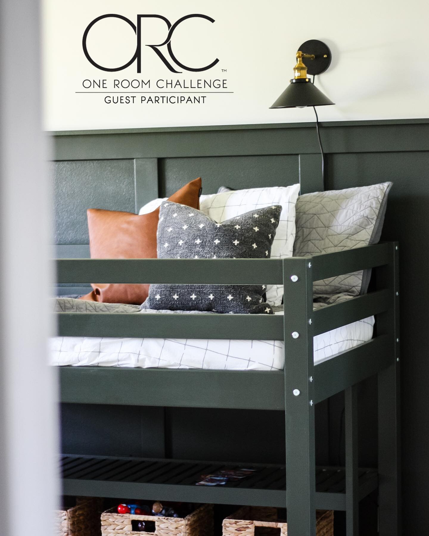
We chose “Ripe Olive” by Sherwin Williams for the board and batten and the bed, and “Polar Bear” by Behr to lighten up the rest of the walls. I wanted Aaron to feel like he had a say in what his room looked like this time around, so I let him choose between 3 curated greens. I was secretly hoping he would choose Ripe Olive, so that was a pleasant surprise!
This time around, I definitely wanted to create a “vibe” instead of a “theme” like his nursery. He’s very into superheroes right now, but that could change in an instant, so instead of painting a superhero mural on the wall, I’m going to create wall art that can be easily switched out when his interests change.
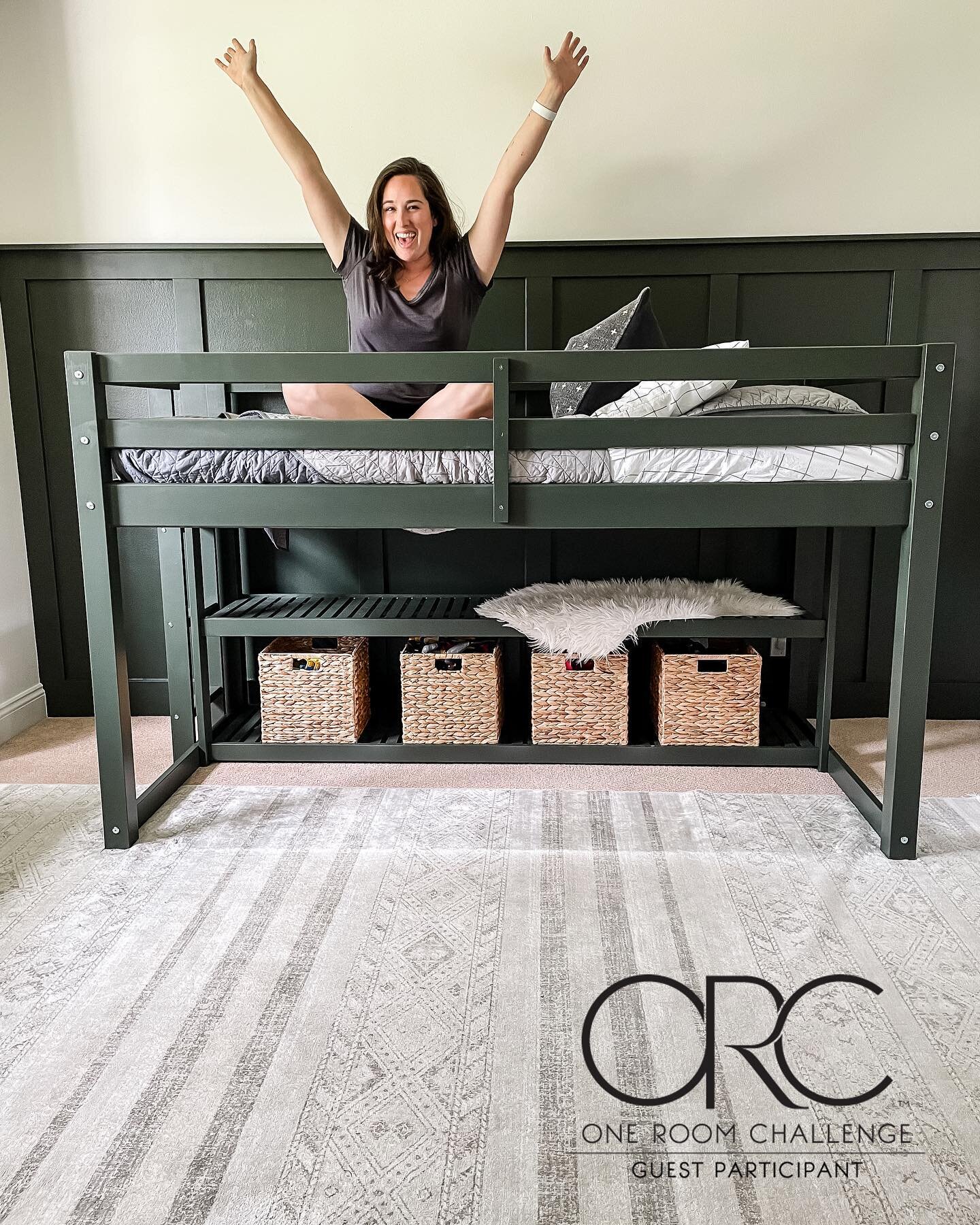
We could have kept his existing bed, but he’s a kid that LOVES forts so we thought a loft bed would be great for him. I’m hoping to add a few things to the area under his bed to make it extra special for him, and his existing bed will go right into Chloe’s room!
I originally wanted the IKEA KURA bed for his room, but quickly decided to pivot when I realized how hard they are to come by right now. I found this loft bed by Better Homes & Gardens from Walmart for $199 and the quality is great! It’s solid wood, and I love that it has a shelf for storage built in.
I took on a paint sprayer for the first time to get the bed painted. It definitely came with a unique set of challenges. Here are some things I learned:
Dilute your paint with water for less clogs (I filled a quarter of the container with water, the rest with paint)
Do many THIN coats. Do many THIN coats. Do many THIN coats!
Don’t over dilute the paint… it will cause drips
Never use a tarp to protect against overspray… it will make a mess.
If you’re spraying a lot of thin boards (as opposed to a built piece of furniture), you’re better off using a saw horse and spraying them horizontally. It’ll be easier to get every side.
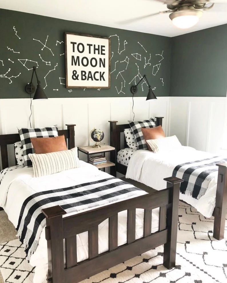
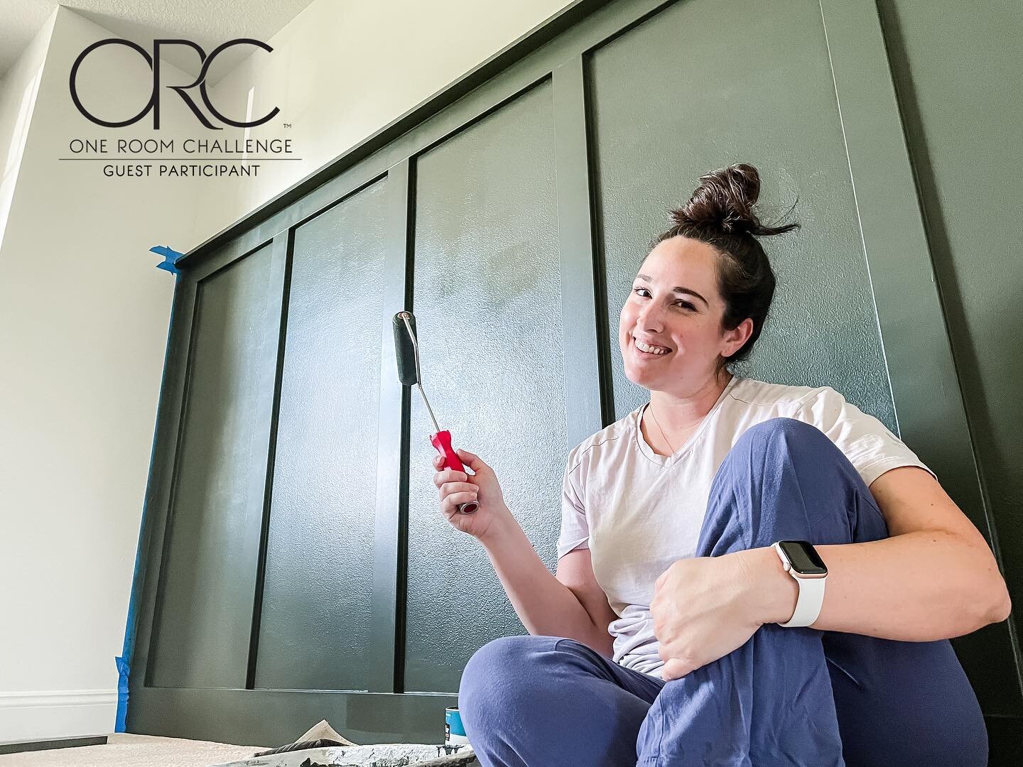
I’m smiling in this picture, but it’s mainly because I hadn’t started moving the boards into the garage yet. Enjoy the blissful ignorance on my face because I didn’t yet know the tarp was going pull off a ton of paint and make a huge mess. Live and learn. Anyway, here are some of the rooms that inspired this space.
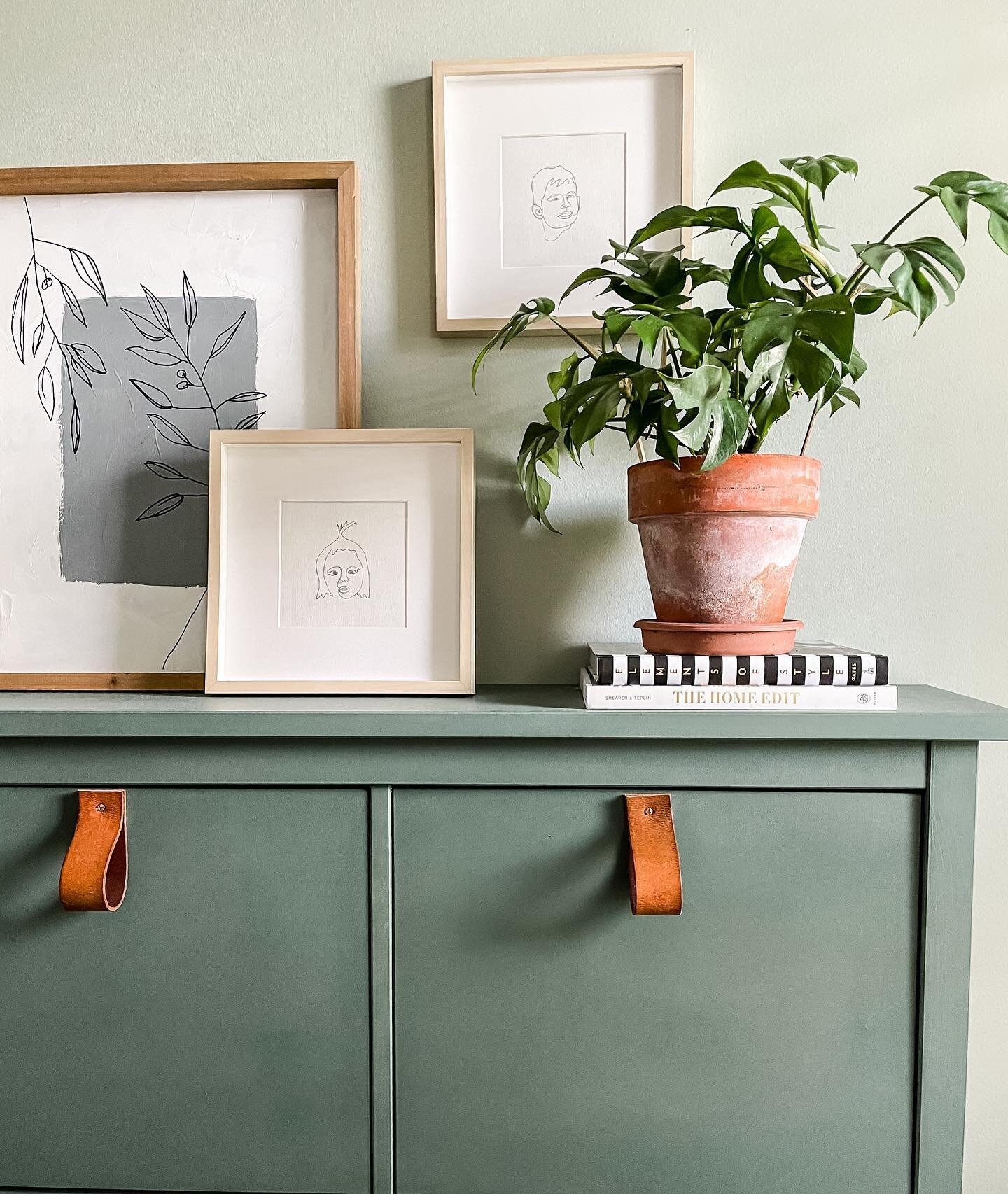
I was really inspired by this space by Bre from Brepurposed. I love the combination of green and white with the pop of camel.
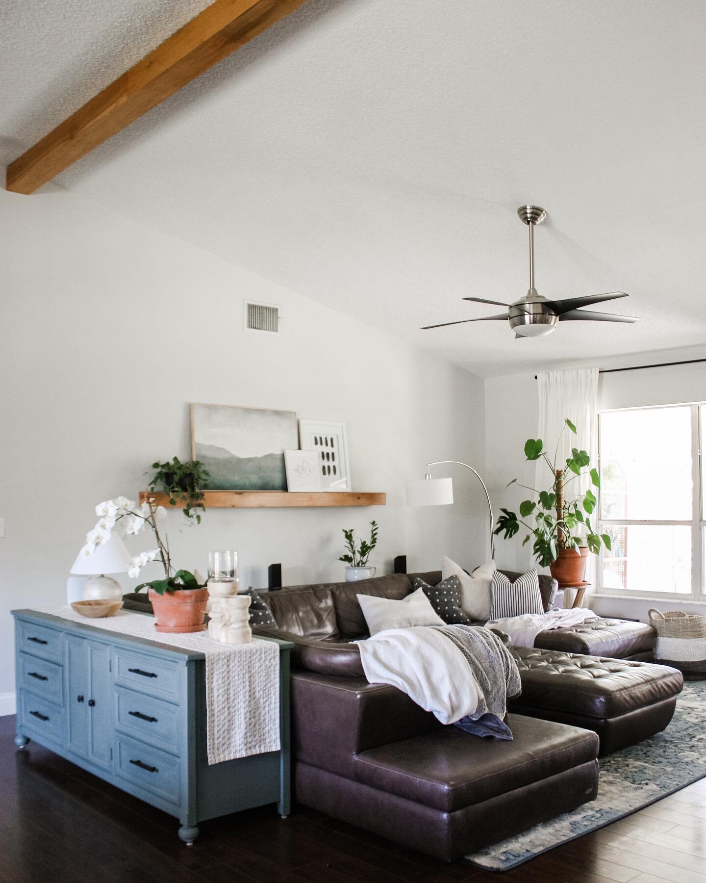
I was also so inspired by this space by Oak and Olive Market:
Stay tuned next week for another update on this space! I’m gearing up to start painting the walls this weekend, and I’ll tell you all about the saga of painting the new bed on Instagram stories. I highly recommend checking out the One Room Challenge blog for tons of inspiration from other guest participants like myself.
Follow me on Instagram for daily updates on this project and a bunch of others!


